Fabric Pattern Designs: A Beginner's Guide to Choosing and Mixing Prints
Learn to pick, combine, and place fabric patterns with confidence—no more guessing.
A pile of fabric prints can feel like a challenge, but with a few simple rules, you can mix them like a pro.
When you stand in a fabric store, the options can be overwhelming. You see florals, stripes, polka dots, plaids, and abstracts—all beautiful, but how do you choose? The good news: you don't have to be a designer to make patterns work together. You just need a few practical guidelines.
This guide covers the main types of fabric patterns, how to mix them successfully, and what to avoid. Whether you're sewing a quilt, a dress, or a throw pillow, you'll leave with a clear plan.
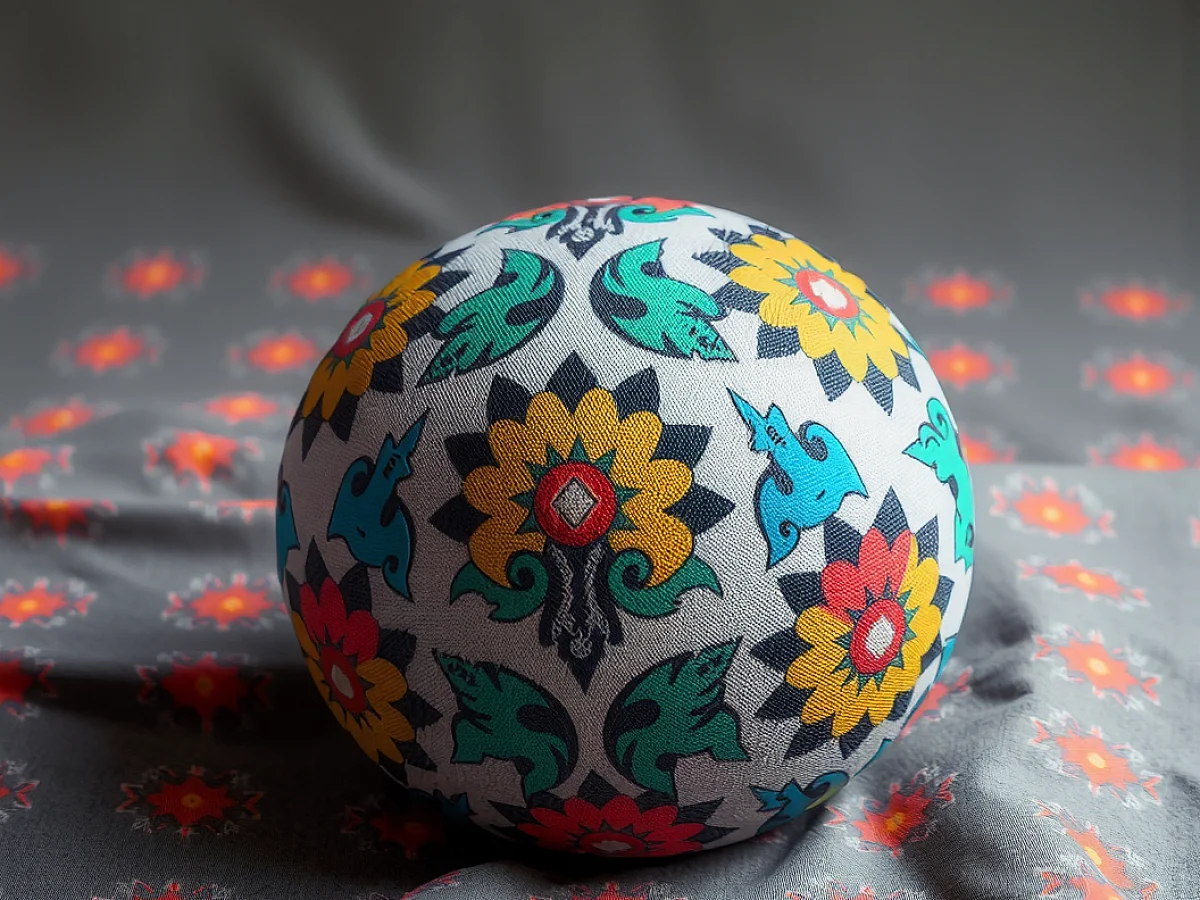
Fabric pattern designs range from florals and stripes to geometrics and abstracts. The key to mixing them is to vary scale, keep a common color palette, and balance busy prints with calm ones. Start with one dominant print, then add smaller-scale companions.
What you need
Fabric swatches
Gather a variety of prints in different scales and colors. You can buy fat quarters or use scraps.
Color wheel (optional)
A simple color wheel helps you see which colors harmonize. You can find one online or at a craft store.
Good lighting
Natural daylight is best for judging colors. Avoid fluorescent lights, which can distort hues.
Camera or phone
Take photos of your combinations to review them with a fresh perspective.
What are the main types of fabric patterns?
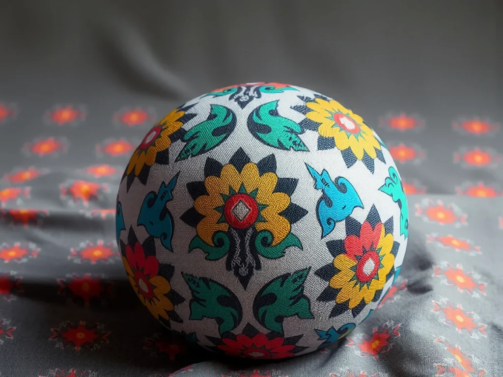
Fabric patterns fall into a few broad families. Florals are timeless—they can be delicate or bold. Stripes and checks (like gingham and plaid) bring structure. Geometric patterns—circles, triangles, diamonds—offer a modern edge. Abstract prints are free-form and artistic. And there are novelty prints with animals or objects, which are great for kids' projects.
Knowing the family helps you predict how a print will behave. Stripes are directional, so they draw the eye. Florals feel romantic. Geometrics feel crisp. When you mix families, you create visual interest.
Start with one pattern you love, then build around it. That makes the decision easier.
How do you mix fabric patterns without clashing?
The secret is contrast. Pair a large-scale floral with a small polka dot. Put a bold stripe next to a subtle check. The difference in size gives the eye a place to rest. If all prints are the same scale, they blur together.
Color is your friend. Choose prints that share at least one color. That could be a background color or a hue in the motif. When colors harmonize, even different patterns feel cohesive.
A good rule of thumb: use one dominant print, one secondary, and one tiny accent. For example, a big floral for the main fabric, a medium stripe for contrast, and a tiny dot for binding or trim.
Lay your fabric swatches side by side and squint. If they blend into a pleasant whole, you're good. If one jumps out too much, adjust.
What are the common mistakes to avoid?
One mistake is using too many patterns. More than three or four can feel chaotic. Another is ignoring scale—all prints similar in size compete. Also, be careful with directional prints like stripes or plaids; they need to be cut consistently, or the pattern will look off.
Another pitfall is forgetting the background color. A white background with red dots and a cream background with red stripes may not match, even though both have red. Check the undertones—warm vs. cool—to ensure they belong together.
When in doubt, use a solid fabric as a buffer. A plain piece between two busy prints gives the eye a break.
How do you choose the right pattern for your project?
Think about the item's purpose. A large-scale floral works well on a throw pillow, but on a tiny pouch it would be lost. A small geometric print is perfect for a shirt or a quilt block. For garments, consider how the pattern falls on the body. Stripes can elongate, while large motifs draw attention.
Also consider the fabric type. Some patterns are printed on cotton, silk, or linen. The drape and texture affect how the print reads. A stiff cotton shows a crisp geometric, while a flowy silk makes a floral look romantic.
Hold the fabric up and imagine the finished item. If you can't picture it, drape it over your arm or a pillow.
How can you test a pattern combination before cutting?
Lay the fabrics on a table and step back. Better yet, take a photo in natural light. Photos reveal clashes you might miss with your eye. You can also make a small mock-up—sew a few scraps together to see how they interact in seams.
Another trick is to use a color wheel. Choose prints that are adjacent or complementary on the wheel. This isn't necessary, but it can guide you if you're stuck.
Sleep on it. Leave the fabrics out and look at them the next day. Fresh eyes catch problems.
What are some reliable pattern pairings?
If you want a foolproof combo, try a floral with a stripe. The organic curves of the floral soften the straight lines of the stripe. Another classic is polka dots with plaid—the dots add playfulness to the structured plaid.
For a modern look, pair a geometric with an abstract. Keep them in the same color family. For a vintage feel, mix small florals with tiny gingham checks.
Remember, there are no absolute rules. Trust your eye, but these pairings are a safe starting point.
When in doubt, use one print as a small accent—like a pocket or a binding—rather than a large panel.
Steps
Gather your fabric candidates
Collect all the prints you're considering. Include solids too, as they may come in handy.
Sort by color family
Group prints that share a common color or undertone. This helps you see which ones naturally belong together.
Pick a dominant print
Choose the one you love most or the one that fits your project's main area. This will be the star.
Add a secondary print
Select a print that contrasts in scale—either larger or smaller—and shares at least one color with the dominant print.
Add a tiny accent
Find a small-scale print or solid that ties the others together. Use it for binding, trim, or small pieces.
Lay them out and evaluate
Place all the fabrics side by side. Step back and look. If something feels off, swap one out. Take a photo and review.
Make a test block
Sew a small sample (like a 6-inch square) with your chosen fabrics. This shows you how they look in seams.
Ways to change it
Monochrome palette
Stick to one color in different shades and patterns. This gives a sophisticated, cohesive look.
Complementary colors
Choose prints in colors opposite on the color wheel (like blue and orange). This creates a vibrant, energetic feel.
Analogous palette
Use colors next to each other on the wheel (like blue, green, teal). This is calm and harmonious.
Neutral base
Pair bold prints with neutral solids like white, gray, or beige. This tones down the busyness.
Scale variation
If you love one pattern, try it in different sizes. For example, a large floral and a mini version of the same floral.
Seasonal twist
Choose prints that fit the season—bright florals for spring, plaids for fall, snowflakes for winter.
The short version
- Fabric patterns fall into families like florals, stripes, geometrics, and abstracts.
- Mix patterns by varying scale—large with small—to create visual interest.
- Keep a common color palette to make different prints feel cohesive.
- Use one dominant print, one secondary, and one tiny accent for balance.
- Avoid using more than three or four patterns in one project.
- Check background colors and undertones to ensure prints truly match.
- Always test your combination with a photo or a small sewn sample.
Questions people ask
Can I mix a floral with a stripe?
Yes, that's a classic combination. The curves of the floral soften the straight lines of the stripe. Just make sure they share at least one color.
How many patterns should I use in one project?
Usually three is a good number: one dominant, one secondary, and one small accent. More than four can look busy.
What if my prints don't share a color?
You can add a solid fabric that appears in both prints, or use a neutral like white or gray as a buffer. Sometimes a thin border of a solid helps tie them together.
Do I need to follow the color wheel?
No, it's just a guide. Trust your eye. If the prints look good to you, they probably are good.
Ready to pick your fabrics?
Choosing fabric patterns doesn't have to be stressful. Start with one print you love, add a contrasting scale, and keep colors in harmony. Test your combo before cutting, and trust your instincts. With a little practice, you'll mix prints with ease. Stitch with ease.

I create easy crochet headbands and simple crochet patterns that are stylish yet beginner-friendly, with a focus on using basic stitches creatively. My angle is combining quick projects with small customizations so you can make something that feels personal without a lot of fuss.